Homepage Design Direction
This page is the visual handoff for future work on the Printmos homepage.
If another AI assistant continues the project, start here before changing the homepage design.
Current Direction
The homepage should behave like a practical product selection dashboard for a print shop.
The main user intent is not to read a marketing hero or fill a generic form. The user came to find a product type, see a rough price/deadline, and continue to a focused calculator for that exact product.
Core decisions:
- Do not put a full calculator on the homepage.
- Do not use a large promo carousel or rotating action banner.
- Do not duplicate the same product choice in several places.
- Make product tiles the main call to action.
- Each product tile should show a product name, simple visual/icon, rough price, and rough deadline.
- Clicking a product opens its own product page/calculator.
- The product calculator page is where detailed choices happen.
- Make it clear that a print file/mockup is useful but not required.
- Keep the visual style minimal, monochrome, clean, and practical.
Primary Target Mockups
Desktop Homepage: Product Grid
This is the strongest current direction for desktop.
The hero is intentionally reduced. The product grid is the main interface.
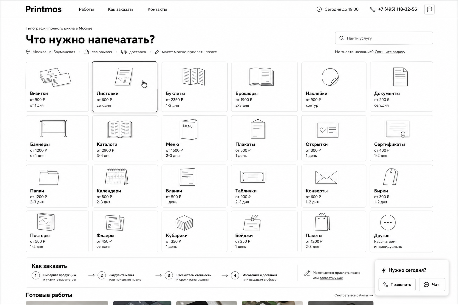
Use this as the main desktop homepage reference.
Important details:
- Header stays useful: navigation, time, phone, chat.
- Intro is compact: “Что нужно напечатать?”
- Product grid is wide and direct.
- No duplicate service grid below the hero.
- No “Рассчитать заказ” button that opens the same product choice again.
- Search is secondary, not the main interface.
- “Другое” remains a fallback tile.
- “Как заказать” and “Готовые работы” can appear below the first screen.
Mobile Homepage: Compact Product Flow
This is the current mobile reference.
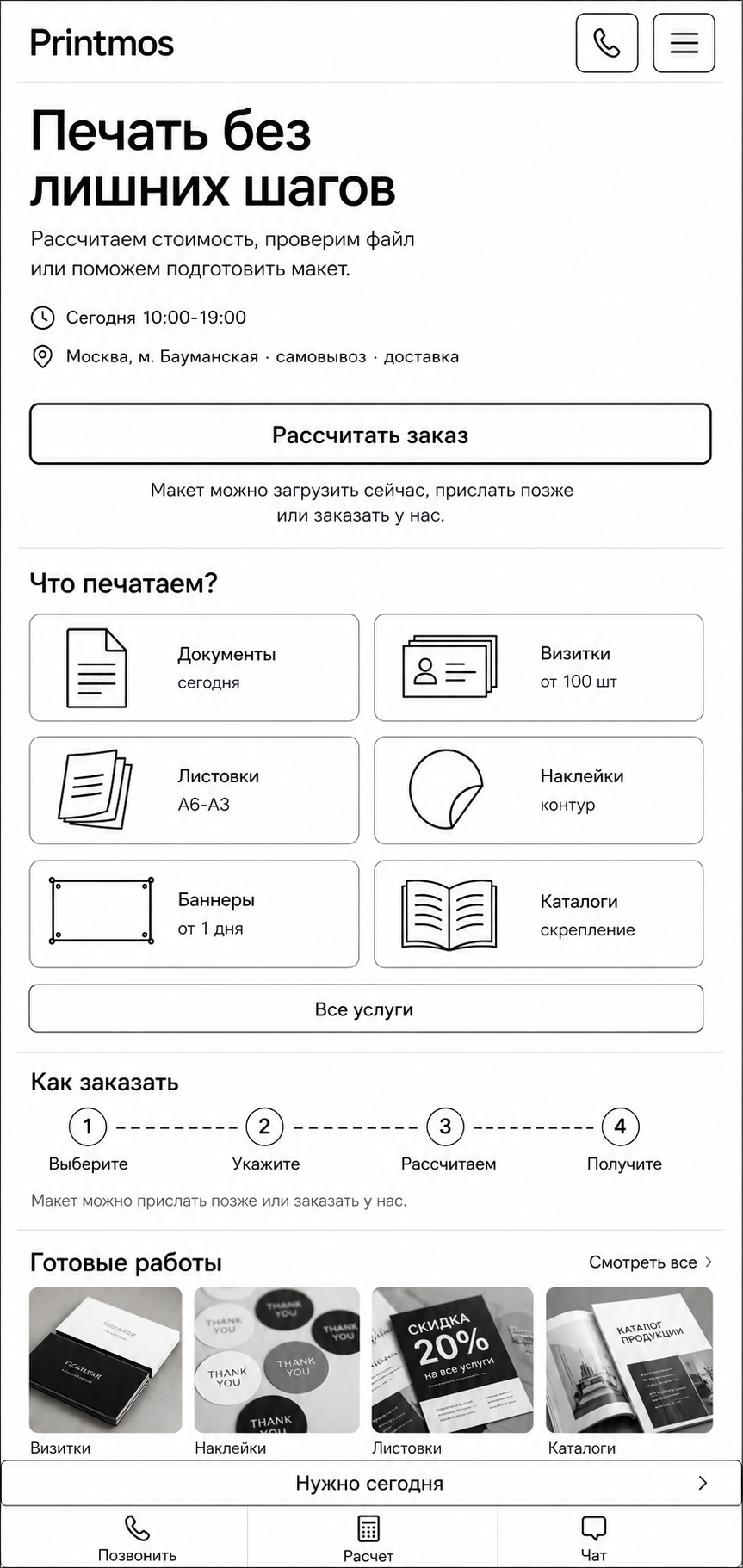
Important details:
- One primary action path.
- Product choice appears early.
- “Как заказать” is compact.
- “Готовые работы” follows the main service flow.
- Bottom fixed area has “Нужно сегодня” above the core actions.
- The fixed footer should stay compact and should not cover too much of the screen.
Product Calculator Page
The homepage should send users to a focused calculator like this after they choose a product.
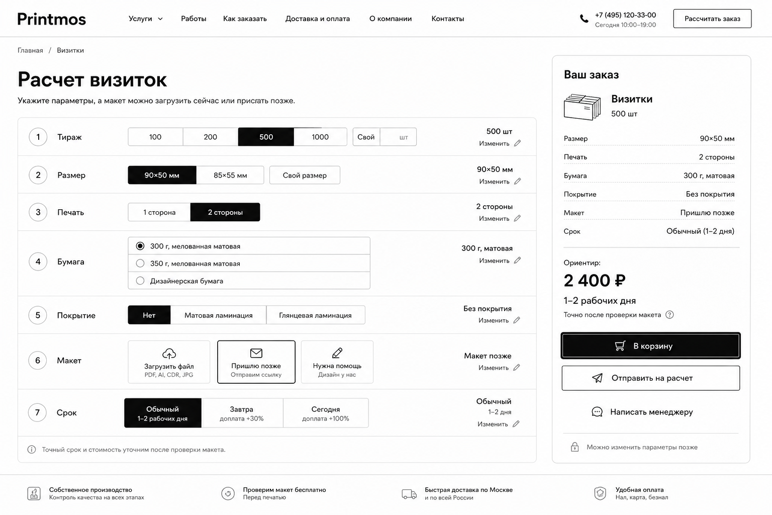
Important details:
- Product-specific calculator, not a universal generic form.
- Parameters on the left.
- Sticky order summary on the right.
- Price is an estimate when exact pricing needs file checking.
- Mockup/file options include:
- upload now;
- send later;
- need help.
Explored But Not Preferred
These mockups are useful history, but they are not the current target.
Homepage With Microform
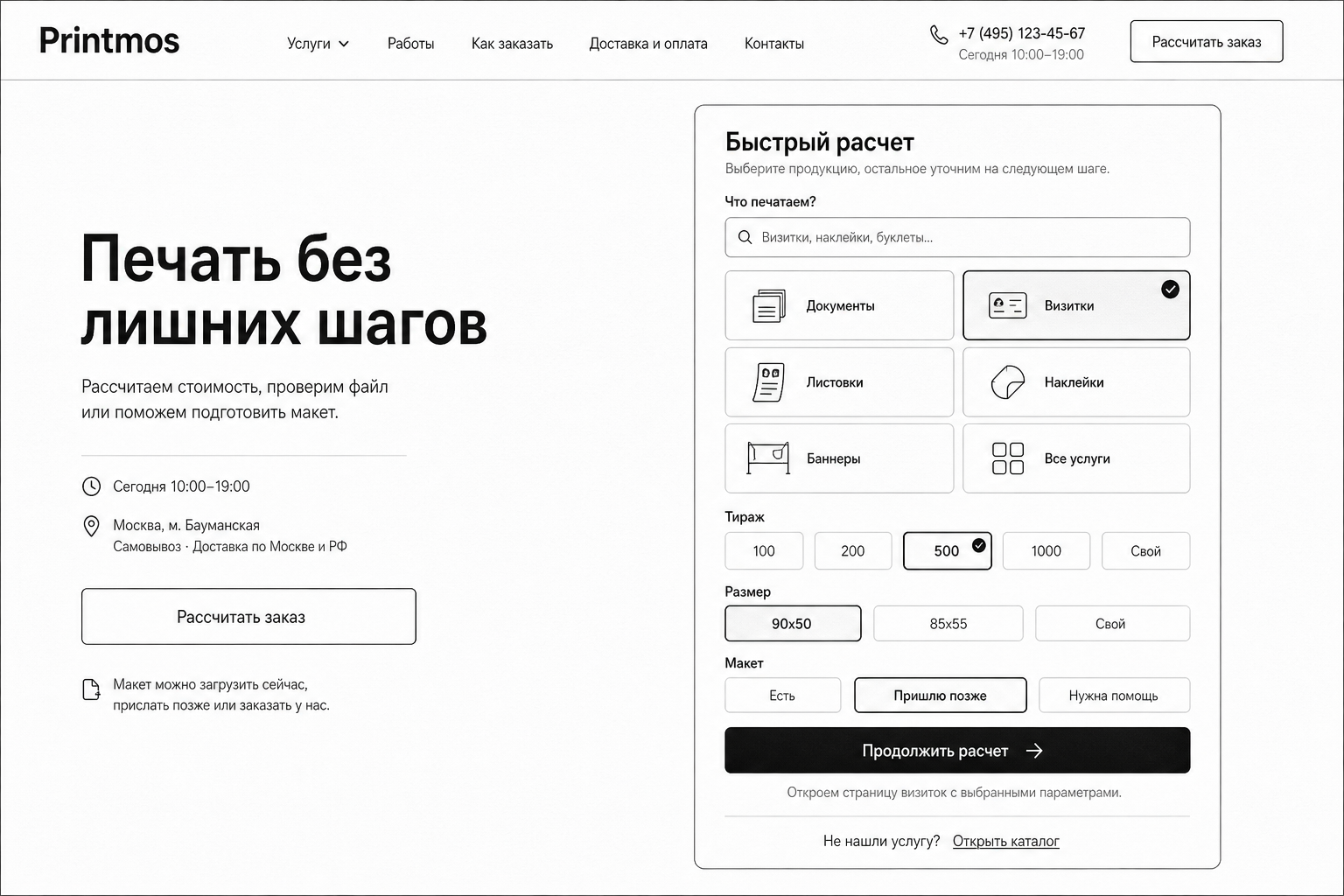
This looked overloaded for the homepage. The form asks the user to think too much before they have even chosen a clear product path.
Current decision: do not use a homepage microform as the primary interface.
Desktop Homepage With Hero Product Block
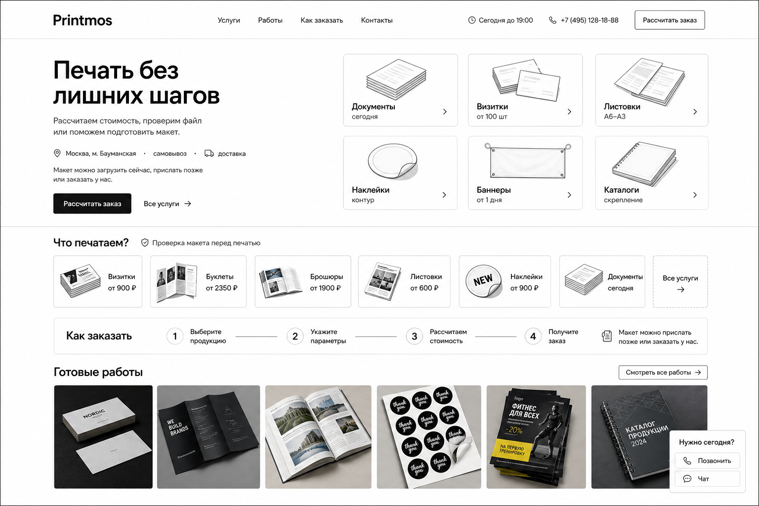
This duplicated product selection: product tiles appeared in the hero and again below. The “Рассчитать заказ” button also led to another product selection step, which made the interaction feel redundant.
Current decision: make the product grid itself the main action.
Earlier Mobile Iterations
These are kept for context only.
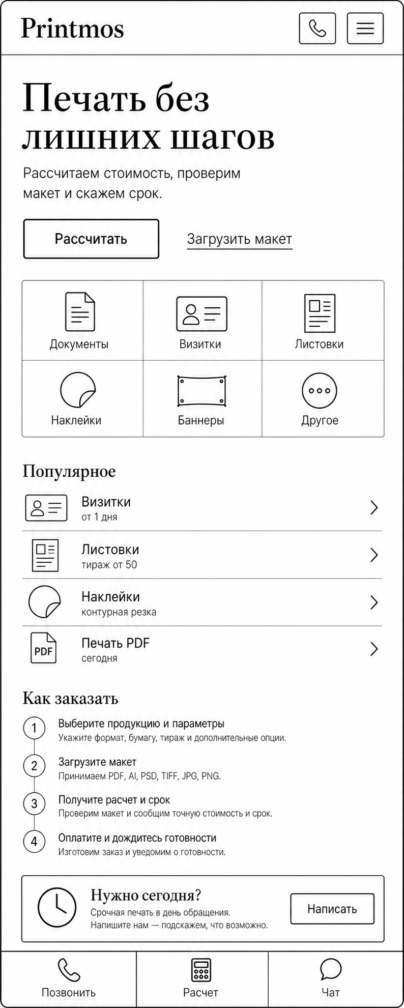
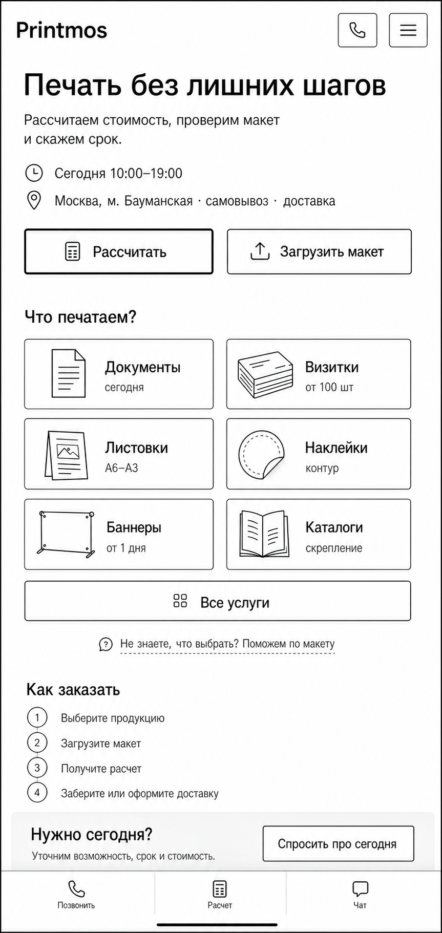
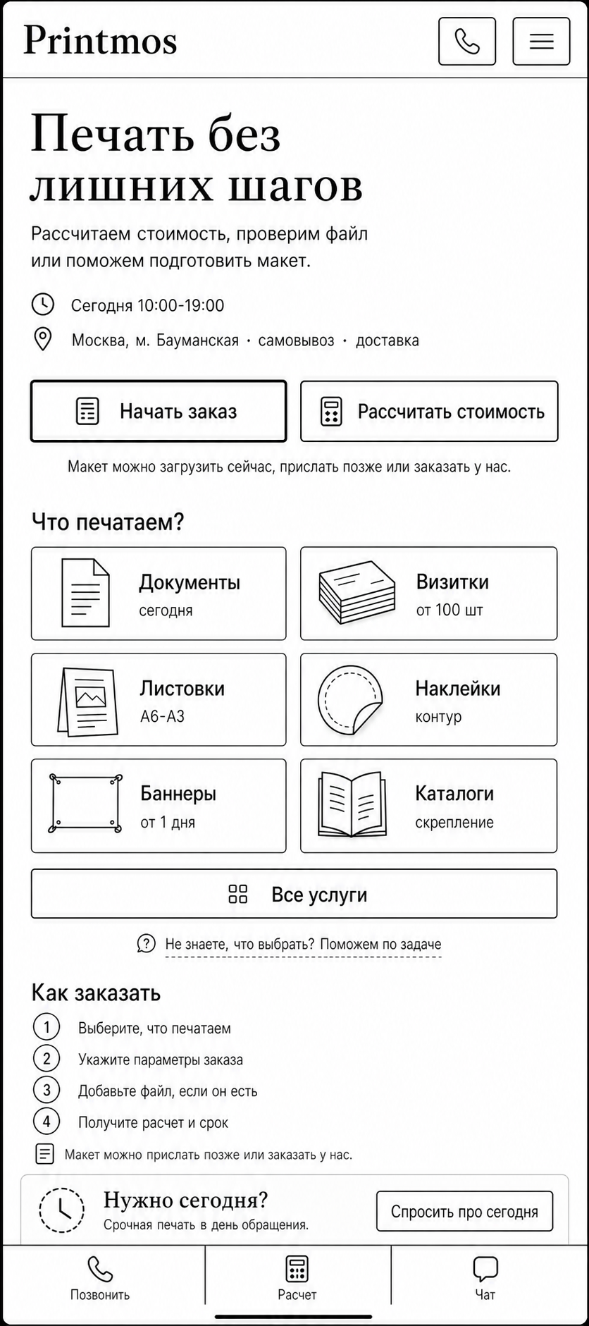
Interaction Rules
Product Tile
Clicking a product tile should open that product’s page or calculator.
Example:
Визитки
→ /services/business-cards
→ calculator already scoped to business cards
Header CTA
Avoid a generic “Рассчитать заказ” button if it opens the same product choice that is already visible on the page.
If a header CTA is needed, it can scroll to the product grid or open the full service catalog, but it should not create an extra redundant step.
Search
Search is helpful, but secondary.
Use it for users who know the product name or cannot find it in the visible grid.
Unknown Product
Use a tile or link like:
Другоеor:
Не знаете название? Опишите задачуThis should not replace the main product grid.
No Ready Mockup
Do not make the mockup/file feel required.
Repeat this idea where it affects action:
Макет можно прислать позже или заказать у нас.Homepage Block Order
Current preferred desktop order:
- Header.
- Compact intro/status line.
- Large product grid with price/deadline hints.
- Compact “Как заказать”.
- “Готовые работы”.
- Contacts/delivery/footer content.
Current preferred mobile order:
- Header.
- Compact intro/status.
- Product selection.
- “Как заказать”.
- “Готовые работы”.
- Fixed bottom contact/urgent area.
Visual Style
- Minimal black-and-white interface.
- Thin borders.
- Simple line icons or small product illustrations.
- Clear typography.
- No heavy gradients.
- No glossy marketing cards.
- No large decorative hero image.
- Real work photos are allowed and useful in “Готовые работы”.
- The site should feel like a clean print order interface, not a generic SaaS landing page.